Showing posts with label Illustrator. Show all posts
Thursday, December 12, 2013 0 comments

Beautiful Losers


I didn’t think I would like the film but it really surprised me I like the idea that they all came together through their love of art and design and making things. They believe that art is for everyone its not just for the rich and upper class people its for everyday ordinary people who are on there way to work or school who see graffiti and drawings on buildings and to them that it the best kind of art, its art that everyone will see and its not boxed up in a gallery somewhere and contained to only those who think they understand what art is and can be.
There view is similar to post modernists they take inspiration from everything and everywhere usually in the places no one else would think to go, they then turn it into something beautiful, another reason why I think they are similar to post modernists is because they believe art doesn’t depend on gender or race, I think that the constructivists where very much purists in there views and thought that’s what I don’t like about them.  These people have fun with what they do they experiment with new ways of creating beautiful new things and it looks fun.  They see graffiti as street art it’s a way of getting there names out there to people and in a way antagonizing people which makes them communicate and graffiti is communication for kids and its most likely the first kind of art form we ever see, people writing there names on walls, it’s a rebellion of what everyone assumes art to be.
As a child your always drawing and making and its totally normal and when you become an adult you have to grow up and you lose it, you lose your creativity, artists are people who are lucky enough to never lose being a child.”  To me this is possibly the best quote I have ever come across because I can relate to it, as a child I was always drawing and makes things out of paper and bits I found around the house, and I never thought I would get the chance to do it when I got older, but I never stopped drawing in school books, or making things out of stuff I found in my school bag when I got bored during a lesson.
They understand that not everything you do is going to be perfect and its about learning from your mistakes and knowing that beauty is the imperfections you have on the page. They put themselves in there art you can see all of there personality in there work because for them it’s a way of life.
The majority of the people came from poorer families and this is why I think they like street art so much, because its where they started and that why they go back to it time and time, they feel themselves and they feel comfortable being out and meeting new people. Art has no rules and its what is so great about it, you don’t have to be smart to under stand art, and that is what brings people together, its takes down the social barriers and enables people to mix.
Watching this film has made me want to start drawing more and using my own illustrations in my work because I no they don’t have to be perfect and I want to start using photography again because I love capturing moments with my camera and I miss doing the things I love because I’m to busy thinking I must do something perfect.


Sunday, March 24, 2013 0 comments

Ross Collins

Ross Collins is an illustrator who was born in 1972 in Glasgow. From a young age he always liked drawing and in 1994 he graduated from the Glasgow school of art with a first in illustration. In 1994 he won the MacMillan children’s book prize. He moved to London for two years where he experimented and refined his style. He then moved back to Glasgow where he now spends his time writing and illustrating children’s books.
As well as illustrating he also works doing character animation.
I like his work its very eye catching and I think there’s a sense of humor behind it which it what draws me into the images more. Even thought the titles of the books have a dark theme to it the colours on the cover are still bright and I like the juxtaposition of this. There is little pattern which keeps the eye on the main object.  


see more at http://www.rosscollins.net/
0 comments

Scott McCloud

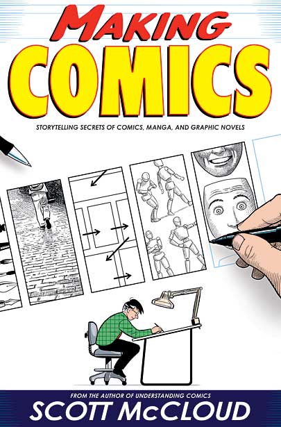
Scott McCloud was born in 1960 in America and is a famous cartoonist. He has written books such as understanding comics and making comics. He studied illustration in Syracuse University where he graduated in 1982. In 1984 he created the science fiction series zot!
I know very little about comics as when I  was younger I never read them and never liked them so to have to look at this artist to me doesn’t inspire me as it doesn’t connect with me. I think he is very good at drawing and to people who like comics they would probably love his work yet I don’t. I don’t want to create comics or read them, however I think in future it would be nice to create something within the same layout style of a comic as they are very eye catching and have a link with pop art which is something I like, but as an artist I don’t really like his work.


see his work at http://scottmccloud.com/
0 comments

Peter Fowler

Peter Fowler is a welsh artist born in 1969 who is most famous for his toys called monster. He is a freelance illustrator who focuses on his monster collection which is inspired by animals, music and folklore. His art work is very unique in style and looks very postmodern and cartoony. The ‘monsters’ which peter fowler have created all live on monsterism island again a place created by peter fowler. The ‘monsters’ all have specific traits and peter fowler has set different levels of monsterism. These toys are very popular which he makes in his own company.
As well as creating toys he has also worked on adverts which has aired in the UK and japan< his most famous advert was the kia piccanto car advert.
I don’t really like the work of Peter Fowler I think it is al to bright and it looks very 60’s which is an ear I don’t really like. The repetition of the bright colours and the psychedelic feel to me is very off putting; however I can see why illustrators would like this work because he is very skilled at drawing.


visit his website http://monsterism.net/
0 comments

John Lawrence

John Lawrence is an English illustrator who was born in 1933. As well as illustrating books he has published some of his own such as this little chick which won best illustrated book of the year by the New York Times book review. As well as being an illustrator he is also a wood engraver which he learnt at the central school of art. Since graduating he as also taught in some school such as the Cambridge school of art teaching children’s book illustration.
John Lawrence as illustrated more than 200 books his most famous was watership down, but he has also illustrated works for Shakespeare.
I like how the work looks like it has been printed either using screen printing or wood engraving; it gives a really nice look. I also like how the book is mostly blue in colour with highlights or red and yellow this makes the certain parts stand out. Even though I’m not madly in love with his work I do really like the thought of using screen printing and wood engraving in the future so might look close at his work in a later time.


learn more about him http://www.childrensbookillustration.com/view_artist.php?id=25 
0 comments

Ian Pollock

Ian Pollock was born in Cheadle in 1950, where he went on to study. He went to the Manchester College of art and design then in 1970 went to Manchester polytechnic. After he graduated he went to the royal college of art and in 1976 became a freelance illustrator.
Since becoming a freelance illustrator he has publishing books such as ‘the miracles of Christ’ and ‘beware of the cat’.  As well as publishing book Ian Pollock has also produced posters for the royal Shakespeare Company. He work often appears in magazines and newspapers due to its style.
In 1984 Ian Pollock published a cartoon version of king lear, the reason for this was to make Shakespeare accessible to all ages as when Ian was in school he didn’t connect with the works of Shakespeare and hoped a cartoon version would encourage children to enjoy and read it more.
in 1997 he was commissioned to create stamps for the bicentenary of Mary Shelleys birth.
I like the idea of designing stamps as I feel that when you get a letter the stamp it usually the only colour seen and it catches the eyes attention so I would like to try and create a few when I’m older also the fact that they are so small would incorporate problems of there own which I think would be fun to overcome. Overall I think Ian Pollocks illustrations are nice but again they are not the type of thing I would want to create and I doubt I would get inspiration form his illustrating’s but I would like to look at the stamps he has created.


see more work at http://www.eastwing.co.uk/artist/ianpollock/
0 comments

Jonny Hannah

Jonny Hannah was born in the kingdom of fife and studied illustration at Liverpool art school. He graduated in 1998 and since then as worked in the majority of the illustration fields, including working on the animation ‘The man with the beautiful eyes’ which aired on channel 4, this animation then went on to win numerous numbers of BAFTA.
As well as working on animations he also produces work for books and posters, he experiments with screen printing and creating work for box sets. In 2001 he co-published the book ‘the captain’s alphabet.’ He has also published ‘hot jazz special’ which was shortlisted for the
2005 Victoria & Albert Museum Illustration Award.
I love screen printing but I don’t really like the work of Jonny Hannah the colours used aren’t the colours I like and I don’t like the overall feel of the images. I like the use of typography in the work but that’s about it, it’s not something I would look at in the future and I doubt I would work in this style ever, because the images look so dark and depressing.


see more of his work here http://www.hornseys.com/art/contemporary/jonny-hannah
Saturday, March 23, 2013 0 comments

Joel Stewart

Joel Stewart is an illustration and artist who attended Falmouth college of art and since then he has been writing and illustrating his stories for a living. He is mostly known for working on his picture books, Dexter Bexley, and for providing illustrations for poet Carol Ann Duffy. “I am trying to make the kinds of images and picture books I thought, or half remembered existed, but couldn’t quite find when I went and looked. Of course they come out some other way again than that, but maybe one day other people will half remember them."
I think the drawings Joel Stewart creates are very vintage and cute, even though I do not think I will work in his style in the future if I was to ever have to do a project around illustration I think I would look closer at Joel Stewarts work to get some inspiration as the pictures he draws are a little creepy and surreal which is what makes me like his work more.

 
see more about this artist at http://www.joelstewart.co.uk/
Tuesday, March 19, 2013 0 comments

J. Otto Seibold


J. Otto Seibold is an illustrator of children's books he is best known for illustrating picture books. His most famous illustrations were created for the author Vivian Walsh.
One of his most famous books is the Alice in ( pop up) wonderland, which offers interactivity for the audience and this I feel is a great idea, however I think personally his illustrations look a bit creepy and I don’t really like them . I think his ideas are good and I would like to think that I could make a pop up book in the future. I think his work is very bright which would appeal to younger audiences but for me it’s just a bit too much.


see more of his work http://www.jottodotcom.com/
0 comments

Kathleen Hale


Kathleen Hale was a British artist, illustrator, and children's author. She is well known for the illustrations she created about Orlando the marmalade cat.

During the 1920s she focused on creating book jackets, posters and illustrating children’s books as well as selling her own drawings.
Orlando the marmalade cat was a story that she would tell her two sons before they went to bed and in the 1940s and 50’s the book became very well known especially due to the illustrations.
To be completely honest I don’t really like the work of Kathleen hale for me they look to old fashioned and dated, I can see why they would appeal to illustration students and children as the drawing its self is really remarkable and the texture on the fur of the cat looks really nice but this style of work is not for me and I doubt I would ever do any work in the style of this artist.


0 comments

Sara Fanelli


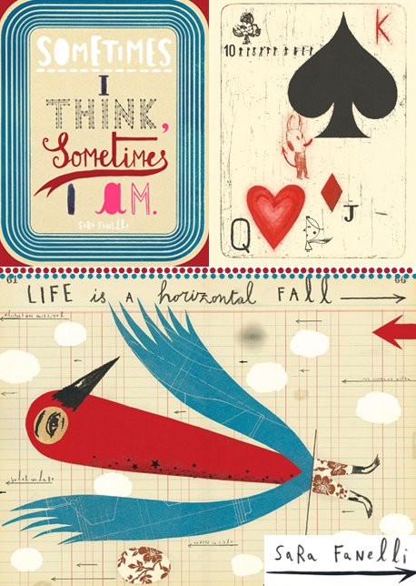
Sara Fanelli is an artist and illustrator who was born ion Florence but studied in London. As well as illustrating books she has also written a few such as sometimes I think I am which won an award in the D&AD.
Considering that I don’t really like children’s illustration that much I do really like this artist as it remind me of the work of Teesha Moore whose work I admire so much. I like the different textures and the patterns used in the image as this adds depth. I also like the fact it looks like it has been manually put together instead of just using a computer and I think many graphic designers spend too much time on the computer and never really experiment with doing manual work. The bright colours attract me to the work and the surrealism that the work projects also attracts me to Sara Fanelli’s work, and I think I would take inspiration form this artist in the future.
 
Even thought this is designed for children I think the surreal feel it has attracts adults also with the bright colours it would easily stand out. I like that it is a little bit creepy and the use of different techniques used makes it far more interesting to look at.


I really like how the colour has been kept simple in this image as it means you focus on the text more, The fact that many different fonts have been used I also really like and in my work I want to start experimenting more with type. I would really like to produce a piece of work like this as it looks like it would be fun to do and it would be something different as I doubt many graphic designers would use this style.


I didn't know that sara fanelli had designed stamps until now and when looking at the artists I was looking over the over of another stamp designer and I was really drawn to this and started to think it would be really interesting to design stamps when i'm older. I like how bright the could is and it would stand out a lot from the envelop. Even though I don't like the design on the stamp that much i'm glad i've seen a stamp that doesn't look boring, it looks like to would capture peoples attention and that is something I want my work to do.


see more work at http://www.sarafanelli.com/docs/bg01.html
 
Monday, March 18, 2013 1 comments

Lauren Child

Lauren Child is an English author and illustrator. She is best known for writing the Charlie and Lola books. The books where realised in 2000 and won the Kate Greenaway Medal, the same as Shierly Hughes.
From an early age she was surrounded by art as her father was head of art at Marlborough college.


I like how the illustrations use collage to give pattern and texture to the work as this lifts the images and stop them looking flat, it also adds a nice break up to the pictures as otherwise they would have been block colour. However I don’t like how the eyes and the hair all start to over lap each other, however I can see how the drawings would appeal to the younger audience .
 
 
see more of her work http://www.milkmonitor.com/
 
Sunday, March 17, 2013 0 comments

David Hughes

David Hughes was born in Twickenham in 1952 and from a very young age knew he wanted to get in to the art and design side of life. In 1970 he left Twickenham Technical College where he studied illustration and proceeded to produce a series of etchings inspired by a piece of jazz music by Charlie Parker. He then moved onto drawing for the daily expresses cookery page. After taking time out to get to understand what he was really interested in doing he got a job at Granada TV as a Graphic designer where he stayed for 5 years before leaving to work as a freelance illustrator.

One of my favourite quotes from David Hughes is, “I am a graphic designer who happens to illustrate” I like how he does not put himself into one box and that he experiments with his jobs to be sure he is doing what he loves, which in my eyes has paid off as he produces some of my favourite pieces of illustration. In the image below I like how it looks like mix media has been used as it gives a surreal affect to the image. The bright pop of red draws the eye in and creates interest. Although I am not studying illustration I would love to be able to produce a piece of work like this.


I like the fact it looks old and vintage. There is a limited amount of colour used in the picture which is another reason why I think I like it so much. I like how to can see every detail of the line work in the piece as it looks like a lot of time and effort has gone into creating it but at the same time gives it an edgy feel and makes it look like its rebelling the normal stereotype of illustration.
This work reminds me of Sara Fanellis but with less colour and brightness used, it has the same technique of using mix media to create depth and I hope that I can create a feel of work manually like this as it would be something different to add to my portfolio.
 

On this piece I really like the typography which has been used as it suits the feel of the image. even though it has been placed in the background suggesting it has less importance its still readable. I like the idea of using hand written text on my work as it will give it a lot more personality. I feel that my style of work would mean I could create something like this as the lines don't look perfect and it looks like David has enjoyed creating this work.


visit his page http://www.davidhughesillustration.co.uk/
0 comments

Tomato

Tomato is a group of artists, designers, musicians and writers, who work on multi media projects. The company was founded in 1991 and since then have gained more clientele and built up a reputable business. As the have people who specialise in many different fields it makes there work more interesting and has given them the opportunities to work on projects which aren’t just graphical, they have delve into projects in publishing, advertising  fashion, public installations, music, television, film and graphic design, as well as putting on exhibitions and live performances.
One of my favourite pieces of work done by tomato is the underworld barking films. I love the vivid colour on the flowers and who you can see the life cycle of the plants and how the colours change with the cycle. I also like how the film has been played backwards to give a different perspective.


0 comments

Ronald Searle


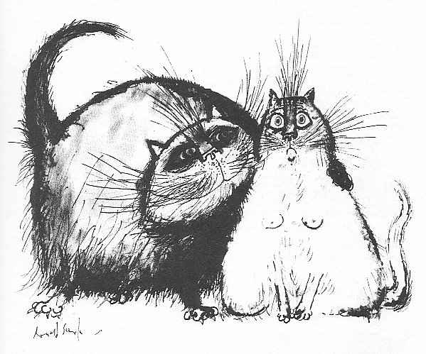
Ronald Searle was a British artist who is most famous for creating the St Trinians School with Geoffrey Willans. He studied for 2 years at Cambridge college of arts and technology, whoever in 1939 he had to give up his dream of being an artist as it was obvious that war was about to take place and Ronald Searle enlisted in the royal engineers. In 1942 he was taken a prisoner of war and was forced to work of the death railway. Even though he was now a prisoner of war this never stopped him drawing and documenting what he saw, many of these drawings appear in his book Ronald Searle: To the Kwai and Back, War Drawings 1939-1945 in which he talks about what it was like to be a prisoner of war. He continued to work of the St Trinians books as well as his book on cats before moving to Paris where he started designing for the cinema and worked on films such as Monte Carlo or bust.
I like how the drawings are mostly in black and white it gives a child like feel to them, I love the drawings of cats he has created as they have so much character and humor to them which appeals to me as I’m sure it does to many other people. And even though I don’t want to go do the illustration path I still would use his work for inspiration.
see more of his work and learn about him http://ronaldsearle.blogspot.co.uk/
http://www.creativereview.co.uk/cr-blog/2012/january/ronald-searle

 
0 comments

Saul Bass


Saul bass is an American graphics designer, title designer and film maker. His most famous pieces of work are the film posters he has created through out his life time including the poster for the film ‘The shining’. He has worked on films with some of the greatest filmmakers of all time including Alfred Hitchcock. As well as working on films bass has also created logos for many of the big companies in America such as AT&T’s bell and globe logo.
His work mostly consists of a block colour for the background with only a few more colours in the foreground which I like as it keeps it looking simple. For the twister poster I love bass’ typographical designs on all his work as it stands out and this is an area I wish to improve so will take inspiration from this. I also like the way that the text looks hand draw as it adds a bit of personality to the work which you don’t always get from using a computer. The poster uses only three colours and yet still captures people’s interest, and this is the sort of look I aim to achieve in future and will therefore be looking at his work more closely.


I like how saul bass keeps the colours simple and never mixes warm colours with cold colours a this makes his work stand out and look really bright and vibrant. I want to start to use screen printing more and I think that looking at saul basses work would help a lot because it uses simple lines and shapes with limited colour and yet to get a very big impact and its hard not to like his work.


Another reason why I really like his work is because of the typography, at the moment I don't really use much in my work and I want to change that as I think type can make your work stand out if it is done correctly. I really like the font used in saul basses work as it always links in with the design, he keeps the font quite square and straight this simple look compliments the fact his work is so bold and bright and ensures that they both work well together.


Monday, February 18, 2013 0 comments

Shirley Hughes


Shirley Hughes is a children’s illustrator and author who has illustrated more than 200 books. She worked on books such as my naughty little sister. Shirley later went on to write her own books and illustrate them her self, books such as Lucy & Toms day, this book was so popular that is was made into a series of over 50 books. The classic and traditional look of her work has captured the minds of many people and has led to her success. In 1977 and 2003 shierlys work won the Kate Greenaway medal for British children’s book illustration. Her most famous piece of work is Dogger and in 2007 was voted the favorite piece of work entered into the Kate Greenaway medal competition.  What has made her such an icon illustrater is the way she works, she believes that “A good picture book is never words with illustrations added later to make it look more attractive. As with a movie, the word and image develop together, independently."
In 1999 Shirley Hughes was awarded with an OBE for services to Children’s Literature.


 Learn more about Shirley Hughes and her work: http://alfiebooks.co.uk/allaboutshirleyhughes.asp
 
;