Peter Fowler is a welsh artist born in 1969 who is
most famous for his toys called monster. He is a freelance illustrator who
focuses on his monster collection which is inspired by animals, music and
folklore. His art work is very unique in style and looks very postmodern and
cartoony. The ‘monsters’ which peter fowler have created all live on monsterism
island again a place created by peter fowler. The ‘monsters’ all have specific
traits and peter fowler has set different levels of monsterism. These toys are
very popular which he makes in his own company.
As well as creating toys he has also worked on adverts which has aired in the
UK and japan< his most famous advert was the kia piccanto car advert.
I don’t really like the work of Peter Fowler I think it is al to bright and it
looks very 60’s which is an ear I don’t really like. The repetition of the
bright colours and the psychedelic feel to me is very off putting; however I can
see why illustrators would like this work because he is very skilled at
drawing.
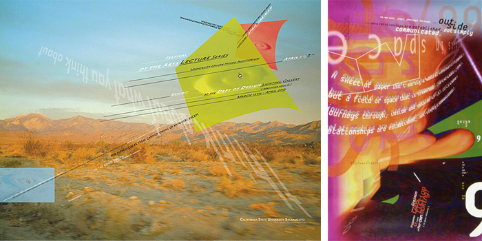
April Greiman is a graphic designer born in New York
in 1948. She studied at the Allgemeine Kunstgewerbeschule in
Switzerland and then the Kansas City Art Institute. She then started working as
a graphic designer in New York whilst teaching as the same at the Philadelphia
College of Art.
IN 1976 April moved to California and opened a graphic design studio in Los
Angeles, made in space.
I like the bright colours that April uses in her work as it makes it look more
interesting, I also think the way the text is on the work as the way it flows
is unique. The way the images are overlaid make the work look like a collage
which I really like. The fact that she has studied in different counties can be
seen reflected in her work as it looks very modern and slick. I think I would
use her work as inspiration in the future however I don’t think I will create
work that looks similar to hers.
Danny Brown
is a multimedia designer, artist and programmer born in Liverpool in
1977. Daniel has a very good grasp with flash and html coding, with this and
his love for design it is not surprising that he focuses on interactive
multimedia. He has been recognised since 1999 as one of the top internet
designers. Like most of the web designers of his era he got his inspiration
from his video games he played as a child which would explain why his work it
witty and full of humour.
I really like the images of the butterfly, I like how they still have the movement
in the wings and the blur adds an interesting twist as most people like to have
clean crisp images. The colours of the reds/yellows and oranges contract with
the pale blue background. I also like how the images are shown in greyscale as well
as colour, even though I prefer the colour images. I think in the future I would
look at his work again as I’m interesting in doing multimedia and expanding on
what I already know about coding.
Kyle cooper was born in 1962 and studied graphic
design in America. He now works in the motion picture world where he does title
sequences. In 1995 he works on the American crime film seven. This title
sequence got him noticed by a lot of other graphic designers especially younger
ones who took inspiration from his work and changed the way graphics would be
seen and used. His work is often compared to the work of Saul Bass.
Since his work on the film seven he has been working on very large block buster
films such as the mummy, spider-man and Sherlock Homes.
As well as working on films he has also worked on TV series the walking dead
which is something that I have started watching at university. Until now I didn’t
even think about going into doing title sequence industry even though I love
watching films and TV. I really like the opening sequence to the walking dead
as it looks grungy and the typography on it suits the feel of the program. Now that
I now about this artist and designer I most defiantly look at his work in
future as I’m now very interested in going into doing title sequences.
Michel Gondry was born in 1963,
and is an award winning screenwriter, film, commercial and music video
director. He has been commended for his new and unique visual style, and takes inspiration
from the mise en scène.
He first started his career by making a music video for the French rock group
oui oui. This video was what put his career as a music videos into full swing
because soon after making his first videos he was directing music videos for
the likes of Daft Punk, The
White Stripes, The Chemical Brothers, The Vines, Steriogram, Radiohead, and Beck.
As well as creating music videos he has worked with artist such as spike jonze
and made a feature film called human nature which was released on 2001.
Michel Gondry's Levi's 501 Jeans
"Drugstore" spot holds the record for "Most awards won by a TV
commercial". I really like this commercial as the music builds up and you don’t
get to see the face of the man until the end which gives a sense of secrecy and
tension. The advert aslo has humour which I think would attract lots of people
to the product which is the aim of the TV advert so it shows how good Michel Gondrys
work is.
Hi-Res! Is a
multimedia design studio and was was founded in 1999 by Florian Schmitt and
Alexandra Jugovic who met at art college in 1993.Alexandra studied fine art and
graphic design and Florian studied is film and music. Over the years they have combined
there skills to create interesting designs in the music and post production
industry. In 1999 the pair moved from Germany to London. In London the started
to create websites using flash, and this lead to wide spread success, they
where asked by film maker Darren Aronofsky to create a site for his film
“Requiem for a Dream”.
In 2012 jagermeister went to hi-res to redesign I love what they have done for
jagermiester as the photography on the website and mobile app is so striking
and strong. I want to start using my photography in my graphics more than I have
been doing and I want the images to be as good as the ones that hi-res have
done because they are so crisp and the detail on the images are very high.
MetaDesign has been one of Europe's most respected design
agencies for over ten years. This company has worked on branding some very big companies
such as Audi. The company was set up in Berlin in 1992 by Uli Mayer-Johanssen
and Erik Speikermann and now has offices around the world such as one in san Francisco,
as well as working with Audi meta design has also worked for Adobe.
I really like the work they have done for the clients especially the
work they did with Audi it looks really high class and I like how the ideas
have not been overly thought and complicated and I think it goes to show that
simple ideas can be just as good as complicated ones. I want to start doing
minimalistic work more so after reading the book by John Maeda and now that I
have found this company I feel I will get some good inspiration from them.
Susan Kare was born 1954 in Ithaca, New York. She
is very famous for designing some of the interface which is found on the original
apple Macintosh. Some of her icons she designed are still on the software used
today such as the Lasso, the grabber and the paint bucket. Another element she
designed for apple was the welcome face when you turned the man on and has only
recently been replaced with the apple logo. She has also worked with Microsoft designing
icons that are still used on the machines today such as the notebook icon and a
few of the icons displayed in the control panel.
Susan Kare also designed the playing deck for the game solitaire game. I like
how the bright blue stands out from the green and how you can see that the
image has been drawn using pixels which makes it look quirky and different,
although I do like her work I doubt I would ever use it as inspiration as it is
not the style I want to work in in the future.
The
Designers Republic is a group of graphic designers, founded on July 14, 1986 by
Ian Anderson, and based in Sheffield. It is known for its anti-establishment
aesthetics. There company shut down in 2009. The worked with brands such as Coca-Cola
and Orange as well as PlayStation games designing sleeves and covers for some
of the most popular games like GTA. They have also designed Cd's sleeves for the
ministry of sound. In 1987 the company designed the cover for the band age of
chance, titled "Don't Get
Mad... Get Even! (The New York Remixes)" this sleeve was in the top 100
best record cover of all time by Q in 2001.
I like the work they have created because it is bright and vibrant in style and
looks like the people who created it had fun doing it and this is reflected in
there work. It looks a bit futuristic and there looks like they have been
inspired by Japanese work, which personally I don’t like as much.
Barnbrook
is a creative design studio located in London, over the years it has become
increasingly popular and is now one of the best known studios in Britain. The company
is a mixture of graphics and motion graphics therefore it is very visually
strong and has worked on many different briefs for clients such as the BBC. The
company has also created work for books; CD covers, websites and fonts, and
currently releases the fonts they make to be used worldwide. In 2007 there work
was exhibitions in the design museum in London.
As well as working for big companies like the BBC Branbrook also works with a
lot of charitable organizations such as the British heart foundation and
created an advert from them to promotion what the charity can offer people suffering
with heart problems. I like how the camera angles around the heart in the
center of the screen and how the fonts are all different which could link with
how different people would relate to heart problems. I haven’t done any work
with motion graphics but would like to start and feel that this advert is the
type of style I would aim towards.
Yugo
Nakamura was born in japan and is today considered the leading web designers of
japan. He likes to ad humor into the work he creates and likes to create his
work using his hands which explains the amount of interactivity his work
involves for the users. In 2007 he won the Tokyo Interactive Ad Awards.
I
like the interactivity that the features offer as it is little touches such as
the moving colour boarders which will make the
website popular and will therefore make people return to the page to see if
there is anything else new to play with that has been added. I also like how
there are noises as it adds another dimension to it and stops it being flat. With
the clay work I like how it still looks rough and not as perfect as the other
work as it makes it seem more real, I have always been interested in web design
and the coding behind the features on pages and I’m glad I have had the chance
to look through Yugo Nakamuras work.
Neville Brody is an Englishgraphic designer,
typographer and art director. He studied
fine art and graphics through is life but has always had a keen interest in
typography. During his time at college his tutors said his work was not good
enough for commercial use as is was too safe and not experimental enough. In
1977 the punk ere was sweeping thought London and inspired Neville Brody to
create a series of stamps with the queens head on the side and this nearly got
him kicked out but this set up his style for the future. He then moved into
creating music covers for bands. As he has a love for typography he helped
co-found the company FontWorks and designed a number of typefaces for them.
I like the pop art feel the Neville Brody puts in his work however it always
seems to have a twist and looks a bit darker. I also like the effects he puts
on his images to make them stand out from other graphic designers, however the
typefaces he has used I don’t really like much as they seem to structured for
me and I like it when they look hand draw as it adds more personality.
See more of his work http://www.researchstudios.com/neville-brody/
Tomato is a group
of artists, designers, musicians
and writers, who work on multi media projects. The company was founded in 1991
and since then have gained more clientele and built up a reputable business. As
the have people who specialise in many different fields it makes there work
more interesting and has given them the opportunities to work on projects which
aren’t just graphical, they have delve into projects in publishing, advertising
fashion, public installations, music,
television, film and graphic design, as well as putting on exhibitions and live
performances.
One of my favourite pieces of work done by tomato is the underworld barking
films. I love the vivid colour on the flowers and who you can see the life
cycle of the plants and how the colours change with the cycle. I also like how
the film has been played backwards to give a different perspective.
Pentagram is a
design studio which was founded by Alan Fletcher, Theo Crosby, Colin Forbes, Kenneth
Grange and Mervyn Kurlansky in 1972 in west London since then they have opened
offices in America and Berlin. The foundation of the company was that everyone
was to be equal to everyone else because of this premise there are no executive
officers or CEOs, everyone has a say and they believe this to be the best way
of generating ideas and keeping there ideas fresh and up to date. As well as
working in graphic design the firm also work with companies to produce an
identity, companies such as citibank and united airlines, they have also worked
on areas to do with architecture, interior design and product design, including
product design for Tesco, Boots and Nike. Pentagram have also worked with the
co-operative brand and this lead to them winning a silver award at the design
business association. I like how they do not just focus on graphics and that
they have branched out to go into architecture and interior design as both of
these where fields I wanted to go into when I was studying at college and
knowing that there is a company that does everything I’m interested in means
that I could in the future be a graphic designer who works on briefs which include
an element of interior design and architecture.
Saul
bass is an American graphics designer, title designer and film maker. His most
famous pieces of work are the film posters he has created through out his life
time including the poster for the film ‘The shining’. He has worked on films
with some of the greatest filmmakers of all time including Alfred Hitchcock. As
well as working on films bass has also created logos for many of the big companies
in America such as AT&T’s bell and globe logo.
His work mostly consists of a block colour for the background with only a few
more colours in the foreground which I like as it keeps it looking simple. For
the twister poster I love bass’ typographical designs on all his work as it
stands out and this is an area I wish to improve so will take inspiration from
this. I also like the way that the text looks hand draw as it adds a bit of
personality to the work which you don’t always get from using a computer. The
poster uses only three colours and yet still captures people’s interest, and
this is the sort of look I aim to achieve in future and will therefore be looking
at his work more closely.
I like how saul bass keeps the colours simple and never mixes warm colours with cold colours a this makes his work stand out and look really bright and vibrant. I want to start to use screen printing more and I think that looking at saul basses work would help a lot because it uses simple lines and shapes with limited colour and yet to get a very big impact and its hard not to like his work.
Another reason why I really like his work is because of the typography, at the moment I don't really use much in my work and I want to change that as I think type can make your work stand out if it is done correctly. I really like the font used in saul basses work as it always links in with the design, he keeps the font quite square and straight this simple look compliments the fact his work is so bold and bright and ensures that they both work well together.
Peter Saville is an English
art director and graphic designer, most commonly known for his record sleeves
and album covers, the most popular of which is closer by joy division which was
created in 1980.
In 1978 after meeting with Tony Wilson, Peter saville became a partner in the
business Factory Records and went on to design sleeves influenced by Jan
tschichold. He was also influenced by the book 'Pioneers of Modern
Typography' which would explain why his work focused on typographical design
which can be seen on many of the sleeves he designed. His work is simple with minimal
colours used as to not over shadow the typography.
In 2003 an exabition of
his work was on display at London’s design museum titled “the peter saville
show.”
John
Maeda is a Japanese-American designer and computer scientist who focuses of
design technology and leadership. Due to the fields he looks into he has wrote
a book titled the laws of simplisity which is aimed at helping people overcome
design problems and flaws and help simplify peoples life in a time where
complex technology could be seen to be taking over. John Maeda is currently the
president of the Rhode Island school of design. John Maeda likes to combine the
technical side of design with the traditional. His work is in the permanent collections of the Museum of
Modern Art, the San Francisco Museum of Modern Art and the Cartier Foundation
in Paris.
Some of John Maedas other achievements
are being named one of the 21 most important people in the 21st century
and receiving the national design award for communication design.
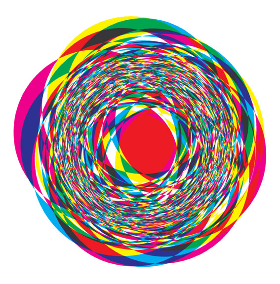
John Maedas Fireball
Read more about the laws of simplicity http://lawsofsimplicity.com/
Shirley Hughes is a children’s illustrator and
author who has illustrated more than 200 books. She worked on books such as my
naughty little sister. Shirley later went on to write her own books and illustrate
them her self, books such as Lucy & Toms day, this book was so popular that
is was made into a series of over 50 books. The classic and traditional look of
her work has captured the minds of many people and has led to her success. In
1977 and 2003 shierlys work won the Kate Greenaway medal for British children’s book
illustration. Her most famous piece of work is Dogger and in 2007 was voted the
favorite piece of work entered into the Kate Greenaway medal competition.What has made her such an icon illustrater
is the way she works, she believes that “A good picture
book is never words with illustrations added later to make it look more
attractive. As with a movie, the word and image develop together,
independently."
In 1999 Shirley Hughes was awarded with an OBE for services to
Children’s Literature.






- Follow Us on Twitter!
- "Join Us on Facebook!
- RSS
Contact